-
DDP Homepage
DDP is operated by the Seoul Design Foundation.
-
Go to the Integrated Search page.

Seoul Design Foundation’s logo is the basis of all design elements that form the CI and is key to establishing the company's image.
PDF Download
Seoul Design Foundation’s logo is a key visual symbol that represents the foundation.
The two rectangles comprising of planes and lines, express Seoul Design Foundation’s willingness to upgrade Seoul’s dignity based on the foundation of design.
The flexible identity represents the foundation's open-mindedness to embrace various designs and reflects its character as a passionate and creative platform for change as well as an innovative and young organization.
The red color represents creativity, activity, passion, change, wisdom, and youthfulness.

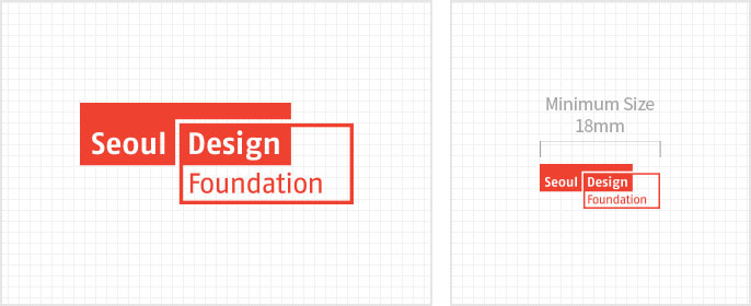
- Minimum Size : The symbol size of the logo should be used no smaller than 18mm.
The logo type is the most basic element that visually conveys the identity of the Seoul Design Foundation along with the logo mark.
Readability was maintained and a sophisticated and individual image was expressed modernly using de-square characters.
It is designed to be harmonized with the image of the logo mark and adjusted proportionally according to the shape of the character, and it is prohibited to arbitrarily change the shape, thickness, and proportion.

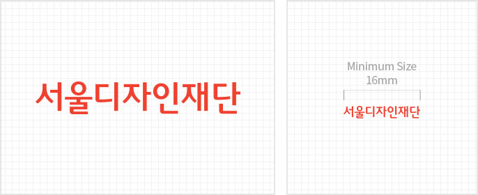
- Minimum Size : The symbol size of the logo should be used no smaller than 16mm.
The Korean logo mark refers to the combination of the logo mark and logo type of the Seoul Design Foundation in an optimal proportion according to a certain standard, according to the media applied
The appropriate combination should be used in consideration of the layout of the applicable space, but the set principles should be observed for the defect method.
The Korean logo mark shall be used when the width is more than 30 mm, and the Korean combination of the logo mark shall be used when the width is less than 30 mm.

- Minimum Size : The symbol size of the logo should be used no smaller than 30mm.
Combined form of Logo Mark and Logo Type. In case the Korean logo mark is used in small sizes in medias, these ‘Left & Right’ and ‘Above & Below’ combination logos can be used instead.
- left-right combination
- top-down combination
Seoul Design Foundation’s logo mark shape and title for its expansive usage in communication
